Try Text Scaling Support in Chrome Canary
Hacker News
Chrome Canary now supports a new HTML meta tag for text scaling, allowing websites to respect user's OS-level text size preferences, a feature developed from a CSS Working Group proposal.
Hacker News
Chrome Canary now supports a new HTML meta tag for text scaling, allowing websites to respect user's OS-level text size preferences, a feature developed from a CSS Working Group proposal.
AI 生成摘要
Chrome Canary 現已支援新的 HTML meta 標籤來處理文字縮放,讓網站能尊重使用者作業系統層級的文字大小偏好設定,此功能源自 CSS 工作小組的提案。
27th January 2026 — 7 minute read
If you have Chrome Canary installed with the 'Experimental Web Platform features' flag enabled, you can now try out a new HTML meta tag:
This is a feature that I proposed at the CSS Working Group back in Summer 2024 and developed with a lot of help from David Grogan and Philip Rogers from the Google Chrome team. You can read the full explainer here. I'm delighted that is finally in the CSS Fonts 5 specification and supported in a browser behind a flag!
Have you ever noticed that when you increase the system text size in your iOS or Android phone's accessibility settings, the text gets bigger everywhere except on the web?
On Safari and Chrome, it makes absolutely no difference.
Interestingly though, on Firefox for Android, the browser does a full page zoom. But that's very different to text scaling.
And that's not great, because research by Appt shows around 37% of Android users and 34% of iOS users have changed their system-level text scale factor from the default. And web developers currently have no way to respect that.
The new tag is here to fix that. Just like how the tag tells the browser that your website is designed to work for small viewport sizes, the tells the browser, 'Hey, I've designed my website to still work if the user increases their OS text size.'
The plan is: once you have on your page, the text will respect the user's text size preference.
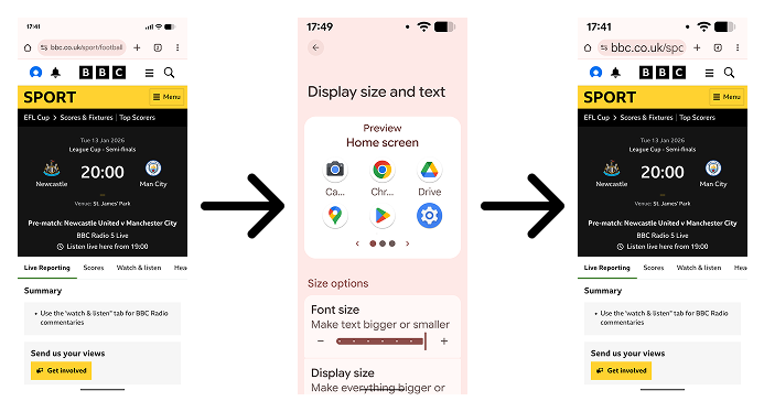
Here's how the BBC website looks with .
This can't be enabled everywhere. Trust me. It would be a bad idea.
Users of desktop browsers can already increase a website's text size, but it's a hidden feature these days. Here's what happens if someone doubles the text size on LinkedIn in Firefox.
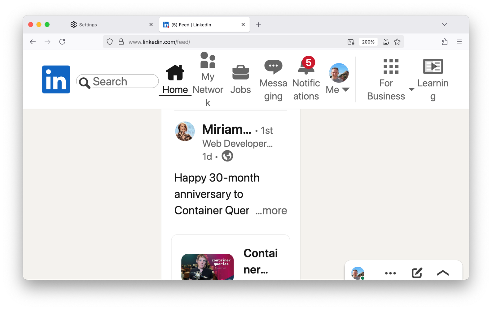
It's a car crash. And I don't mean to single out LinkedIn. There are many examples. In fact, most of our websites probably would look something like this.
And this is just on large desktop viewports. Imagine what would happen if we enabled this on mobile devices!
Even on smaller viewports, users should be able to increase the text size up to 200% without having to horizontally scroll. The relevant WCAG 2.2 guidelines are 1.4.4 Resize Text and 1.4.10 Reflow.
So that is why it's necessary for us to opt-in. Just like how from 2008 – when the first smartphones came out – it was necessary for us to opt-in to supporting mobile viewports.
You shouldn't wait for all browsers to support before you support text scaling. It's something we all should be supporting anyway but probably haven't been testing for. Desktop browsers have recently been hiding their text sizing features in favour of zoom. And we've all probably been testing zoom instead.
Zoom increases everything, including images, padding, margins, gaps. Everything. And that's regardless of whether you're using em units or px units.
True text scaling is different. It only changes the default font size.
You've probably been taught a best practice similar to this: always use font-relative length units in your CSS, like em or rem, not absolute units like px or cm. If you use px units, your website won't support text resizing.
That is mostly true, but it doesn't mean you can never use px units.
These are my three basic tips for supporting text scaling.
The default font size comes from the initial value of the CSS font-size property. If an author doesn't specify a size, the initial font-size is medium. But what is medium? Typically it's 16px. But on desktop browsers, users can change it to whatever they want.
This is ultimately what the tag does: when the tag is present and once browsers support it, mobile users will be able to change the default font size as well.
So if you override the default font size, the tag will have no effect.
Ideally, don't touch it. Or use percentage values to modify it.
Text scaling doesn't need to replicate zoom. If you use font-relative units like em and rem everywhere that you set a length, everything will scale up the same way as browser zoom.
Instead, only use font-relative units on things like text, images and icons. You don't need to use it on properties like margin, padding or gap.
If you do that, there's more room for the content, which is especially important on portrait mobile devices.
What about border-width, though? I think borders generally count as content, but you need to think of the use case. A button or text box border should get thicker, but a divider line between list items is arguably aesthetic and you could define its width using px units.
Try to simulate a user on a cheap smartphone who has doubled their text scale.
On a desktop browser, open the viewport tester in the dev tools and set the viewport to 320px width. Then, change the text scale to 200%. See the env(preferred-text-scale) explainer for how to do that in each browser.
If you do that, you'll quickly see the problem areas. Think about how to adapt your layout to fit very large text.
There's more to think about, but I hope that's enough to get you started!
Hopefully the other browsers will start to support it later in the year, but I've not heard any information about it.
There is one problem we're still thinking about: how do we get large text to scale at a lower rate than body text. It's great that the body text can scale up from 16px to 32px, but does heading text need to scale up from 32px to 64px? It's already huge. If you have any thoughts, please do let me know!
I'll be talking more about this at CSS Day 2026 in June. I hope to see you there! And I'm sure there will be more documentation published about text scaling later in the year. I think it's an area we're all lacking experience with after relying on browser zoom to keep us going for so long.
I'm a Senior Software Engineer at the BBC who likes to talk about Web standards, CSS, design systems and Intrinsic Web Design.
Powered by the Hylia Eleventy Starter Kit v0.7.0.